Creating a visual identity for your Substack
How to use logos and fonts to make your Substack more branded and distinctive
Brand design elements like fonts and logos send a message to readers about what to expect from your publication. Plus, it’s fun to express yourself by customizing your Substack’s color palette and uploading design touches like logos. This post walks you through the basics of managing the visual identity for your Substack.
Changing the font and background color of your Substack
To change the font and background color of your Substack, go to your Settings page, scroll to the Branding section, and click Edit theme.
You can use the drop-down menus to select a color, or type in the hex codes. Your Accent color is used for buttons; select a color that best represents your brand.
You can make your welcome page background a different color than the rest of your publication by unticking the “Use same color for welcome page” box, and selecting two different colors for “Web background” and “Welcome page background”.
To finalize your color selections, click Saveto save changes.
Adding design elements to your Substack
You can add design elements on your Settings page, which you get to by clicking Dashboard, then Settings.
You have three design elements you can upload: Publication logo which is at the top of the Settings page in the Basics section; and, Wordmark and Cover photo, which are further down in the Branding section.
All these items are optional, and you can easily publish a Substack without uploading any of them, but they do help make your publication look distinctive and branded.
Publication logo
Your Publication logo appears at the top-left-hand corner of your Substack publication page on the web. It should be a square image least 256 x 256 pixels.
Cover Photo
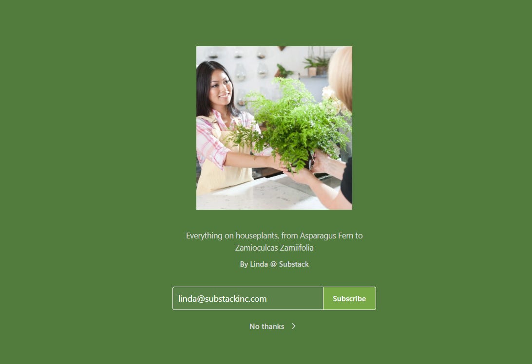
Your cover photo appears on your welcome page. That’s the page publication visitors see the very first time they view your publication on the web. It’s located at [whatever your Substack subdomain is].substack.com/welcome.
Your cover page image can be a custom design you made or had somebody make for you; a picture you took; or, a photograph of yourself. Another option is a stock photograph from a website like Unsplash or Pixabay. For Houseplant Weekly’s cover page image, I used a stock photo which I downloaded from Unsplash and uploaded to my Substack via my Settings page.
Wordmark
Your wordmark appears in the centre of your navigation bar on the main publication page of your Substack. A wordmark is a stylized image version of your publication name. It should be at least 1344 x 256 pixels.
Here’s what my publication page looks like now that I’ve uploaded my wordmark. Notice that the text for the name of the publication at the top center of the page, is replaced with the wordmark I uploaded:
If creating a wordmark sounds way too complicated right now, don’t worry — it’s optional. If you don’t upload one, the name of your publication will still appear at the top of your publication page, in the default font.
Hope this information helped you get started with adding visual distinction to your Substack! For more detailed information on refining your Substack’s visual identity, including advice from professional designers, check out this resource from Substack Grow: Building a home for your publication


Thank you! Is there a way to make the wordmark bigger?
Hi… design site is not under settings. Where else should I be able to find it?
Thanks!